
Group Blog Post #2 - Card Sorting
- Claudia Feochari
- Mar 9, 2021
- 3 min read

Updated: Mar 10, 2021
Introduction
Information architecture (IA) is the backbone of any digital interface. It is usually documented in hierarchical tree form and organizes the layout and structure of the content and functionality. Despite not seeing the structure of the interface, users still hope that content is divided in a way that meets their expectations. Therefore, a good architectural tree must fit the user’s mental model, guide users where they want to go and provide precise information scent (interface content). To test for a robust IA, card sorting is often used.
Card Sorting is a research method that determines how users put different website elements into categories.There are three types of card sorts: open, closed and hybrid. Open card sorts are involved with a user putting cards into categories that the user creates whereas users only sort cards into predefined categories in closed card sorts. A hybrid card sort combines both concepts of open and closed sorts where users sort where there are predefined categories and the user could also add their own categories. Our group has decided to use the hybrid card sort testing approach.
Reports on the findings
Participants were asked to sort Monitool’s features on the app’s pre-existing categories. There was also the possibility of creating an entirely new category if the one available did not resonate with the participant. In the following table, we show Monitool’s current information architecture:
Table 1

Please follow this link to see Participant Screenshots
Through the Similarity Matrix (table 2) we identified that The features ‘Email hours’, ‘Offline Hours’ and ‘Breaks Taken’ were grouped and situated under the <Work-Life> category by 70% of the participants. Also, the features ‘Tracking Status’ and ‘Completion Percentage of Projects’ were grouped by 70% of the participants under the <Project Progress> category.
Moreover, participants were likely to group ‘Efficient meeting hours’, ‘Names of my team members’, and ‘Overall score of my contribution to my team projects’ features, which were different than how it’s currently offered in the app. The Dendrogram (table 3) shows that 50% of the participants agree with parts of this grouping.
Similarity Matrix

Table 2
The Best Merge Method (BMM) Dendrogram
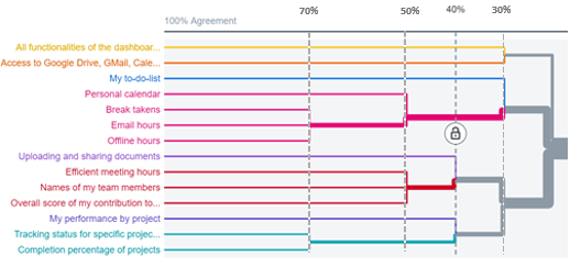
Table 3
Modified Standardization Grid

It was surprising to see that all participants had different mental models, despite them being from the same target segment.
The problem was depicted in the categorization of <Project Progress>, <Team Collab>, and <Work-Life>. Participants had extensive trouble allocating the card, “Names of my Team Members”. Zero participants allocated this card under <Project Progress> which is what was expected. Instead, the majority of the participants allocated this card under <Team Collab>. The card ‘My performance by project’ was placed under <Project Progress> by more than half of the participants, instead of the expected <Team Collab>. Half of the participants also placed ‘Efficient Meeting Hours’ under <Team Collab> instead of <Work-Life>. Finally, only 3 out of 10 participants correctly placed ‘Personal Calendar’ under <My tasks>.
One of the participants asked “Is the Project Progress for personal projects or team projects?” When asked about this in detail, participants all responded that <Team Collab> and <Project Progress> labeling were not very straightforward, because projects are usually done in teams, and the terms are used interchangeably.
The key associative insights are to include the feature of ‘Efficient meeting hours’ and ‘Name of my team members’ under <Team Collab>. Also, to include a ‘Personal Calendar’ under the <Work-Life>. Lastly, according to the results, we will evaluate the names of the categories <Team Collab> and <Project Progress> to make them more intuitive.
Check out my teammates blog posts:

Comments